by Francesca Marini and Sebastiano Tassinari
On the occasion of the twentieth anniversary of the release of The Lord of the Rings on theatres, we continue our journey to discover Peter Jackson‘s trilogy. This time we have an exceptional guest as an interviewee: not just an expert on the subject as in previous cases, but a person who worked in the production of the films. We are pleased to be able to offer you an interview with Daniel Reeve, the calligrapher who made most of the inscriptions found in the films: books, maps, signs, engravings…
Thanks for giving us this interview Daniel! Starting with our usual question: how and when did you meet Tolkien?
When I was about thirteen, my older brother read The Hobbit, and told me it was good, and that I should read it – so of course I did. He then moved on to The Lord of the Rings, and said that I must read that, too. Naturally I read it, and I became engrossed with it, and read all the Appendices also, as well as The Silmarillion and other Tolkien works, and I started writing runes and tengwar.
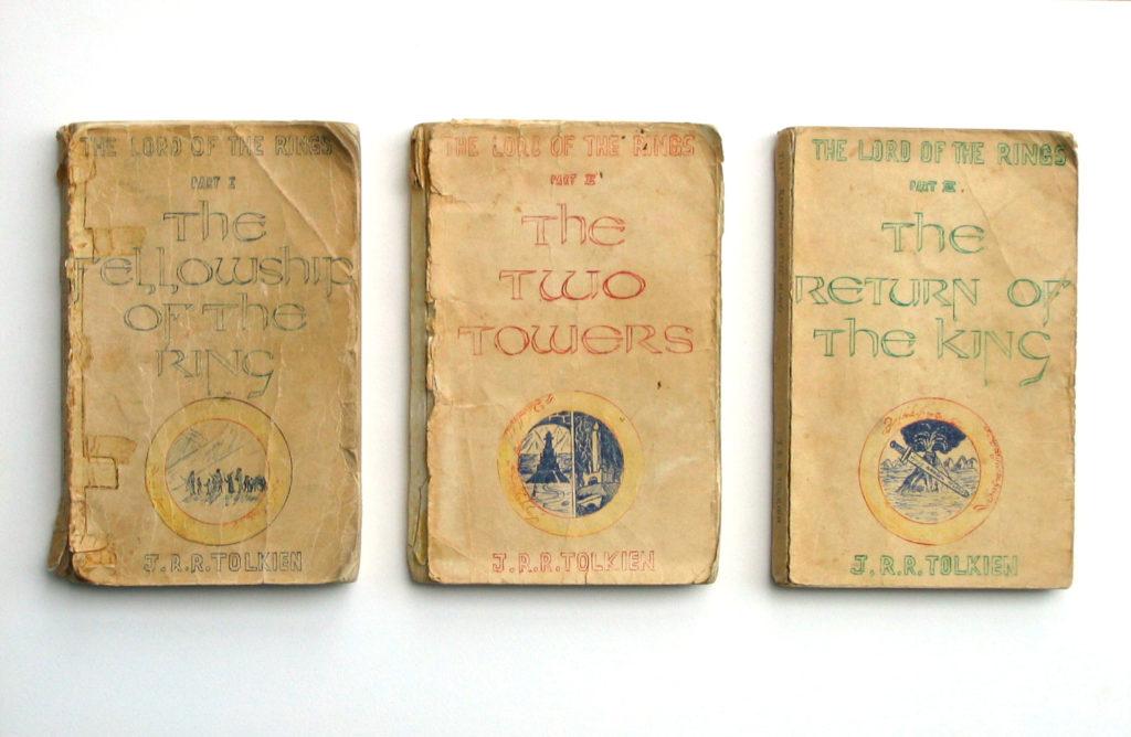
I even cut my brother’s single-volume paperback of The Lord of the Rings into three parts, and made new covers for them (see photo). So as you can see, my love of lettering an art began a long time ago.

The ancestors of Tolkien’s father’s side were master engravers, and also his grandfather John Suffield used to write the whole Lord’s Prayer in a circle the size of a sixpence coin to show his skill. Did Tolkien in your opinion inherit this talent? Just as he sought euphony for the Elvish languages, do his alphabets serve well as calligraphic exercises?
Tolkien did some very good calligraphy and artwork. He had a good eye for establishing a harmonious ‘look’ in the pieces he wrote in his various alphabets, as well as in his drawings and patterns. I think his alphabets do serve well as calligraphic exercises, and as good instructional templates for inventing writing systems.
Before working on Peter Jackson’s films, how did you cultivate your passion? What alphabets and texts did you enjoy reproducing?
I enjoyed writing uncial letters (thanks to the map of Middle-earth on my bedroom wall – the one drawn by Pauline Baynes), and the blackletter hands. I learned quite a lot from the Speedball Textbook. And since those early days, I have had love affairs with italic, with pen manipulation, with brushed roman capitals, with oriental calligraphy; as well as re-visiting uncial and gothic scripts.
Finally, in New Zealand, where you live, an entire film industry has sprung up with one purpose: to film The Lord of the Rings. How did you become part of the project?
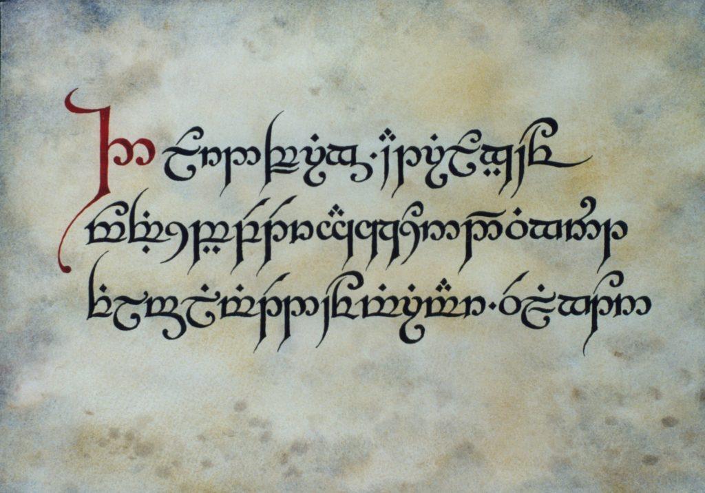
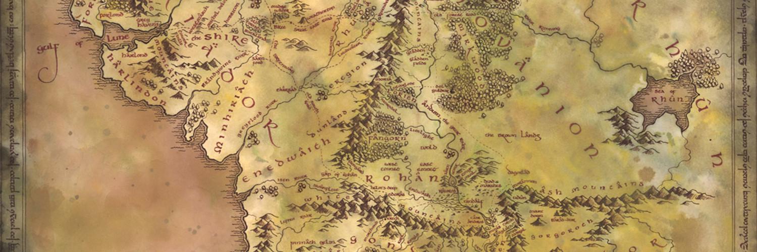
I wrote a letter to the film company, suggesting that I could do some calligraphy work for them, and I enclosed an example of some elvish lettering (see photo). The phone rang immediately, and they asked me to come and talk to them at the film studios. I came away from that interview with the job of doing calligraphy for The Lord of the Rings. Later, this expanded to include making all the maps. After the filming, I became involved with New Line Cinema, creating the lettering for their merchandise and publicity style guide, as well as the famous Middle-earth map.

You actually did a lot of manuscripts for the trilogy. Did you have very tight deadlines? Did you work on the props in a similar order as they appear in the films?
Films are often shot out of order. For example, if you build the set of Bag End, you shoot everything that happens in Bag End, no matter when those scenes appear in the trilogy. The deadlines are almost always tight; I would make all the props and then as many of the set dressing pieces as I could, in the time available before shooting that set.
How were the scenes where someone writes in the handwriting you designed shot? Did Ian Holm and Elijah Wood only add the last letters to pages you had already prepared?
I had sessions both with Elijah Wood and with Ian Holm, to teach them how to write with a quill, and how to write in the style suited to their character. Both of them were excellent students. I pre-wrote numerous copies of the pages on which they would be doing their writing. And I was on set as they wrote on camera, to offer any last-minute advice and support. I recall that Elijah wrote the last few words of the sentence: «It was the bravest thing he ever did» at the end of the Red Book, and then added: «by Frodo Baggins», to complete the title page. Ian Holm wrote: «Concerning Hobbits» at the start of the book. For The Hobbit trilogy I did all the writing on camera myself.
Among the objects you had to make there are many maps: Middle-earth, the Wildlands and Erebor, the Shire… Was it exciting to give geographical concreteness to Tolkien’s world as his son Christopher did?
Absolutely – this was an absolute joy to me! Maps that appear in books such as The Lord of the Rings always add so much to the experience of reading the text. I am very happy that my maps have added to the layers that make Middle-earth a real place in the imaginations of those who read the books and watch the films.
In the film, the Hobbits and Men write in Latin characters, but then you had to make inscriptions in tengwar and cirth. Did you slavishly follow the information given by Tolkien or did you have to make additions or changes to transliterate the English language?
I used what I had gleaned from Tolkien’s pieces, transliterating according to his examples as best I could, with a few inventions to facilitate writing in English. Some key pieces were written in their appropriate language, such as the inscription on Gilraen’s tomb in elvish. I have since learned more than I knew then, so I would make some things differently if I did them now.
The Book of Mazarbul has the worn appearance with which Tolkien himself would have wanted to include it in the book. How was the aging of the props simulated? Did you yourself contribute to the process?
Of course! I mostly use watercolour, in several layers, to achieve aging effects, plus various creasings, crumplings, abrasions and other distressing techniques. Sometimes I use acrylics, if the piece demands it.
Other inscriptions present in the film, but not on “parchment”, were made by David Salo. Was your collaboration very close? Did you have to deal with other people on the staff, for example concept artists John Howe and Alan Lee?
I’ve never actually met David Salo, though I think we emailed a couple of times. It’s a little surprising that our paths didn’t cross more. I worked with Alan Lee several times on The Lord of the Rings, and with both him and John Howe on The Hobbit, and with John on several other projects since then.
Is there any piece you made that you’re particularly proud of, with a unique story behind it? Maybe something that wasn’t even framed in the extended version of the films?
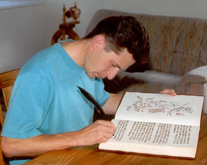
The Red Book was special to me, for several reasons: the time spent devising the writing styles for Bilbo and Frodo, cutting quills and perfecting their use, and the freedom I was given to write the book in my own words, as Bilbo, and as Frodo, and to add illustrations and maps and embellishments as I saw fit (see photo). Meeting and training Elijah Wood and Ian Holm, as part of making it. And being given sufficient time to craft it properly, rather than being rushed. I had actually written the first six pages or so before I realised I was writing in the back of the book – I had never turned it over and seen the design on the front cover! Luckily the Props Master had the bookbinders remove the cover, turn it around, and re-bind the page block back into it, and I carried on as if nothing had happened.

Are you working on any other film productions that will be released in the future?
Ahh, that is a question I’m not allowed to answer. I’ll leave the interpretation of this ‘non-answer’ up to you… 😉


